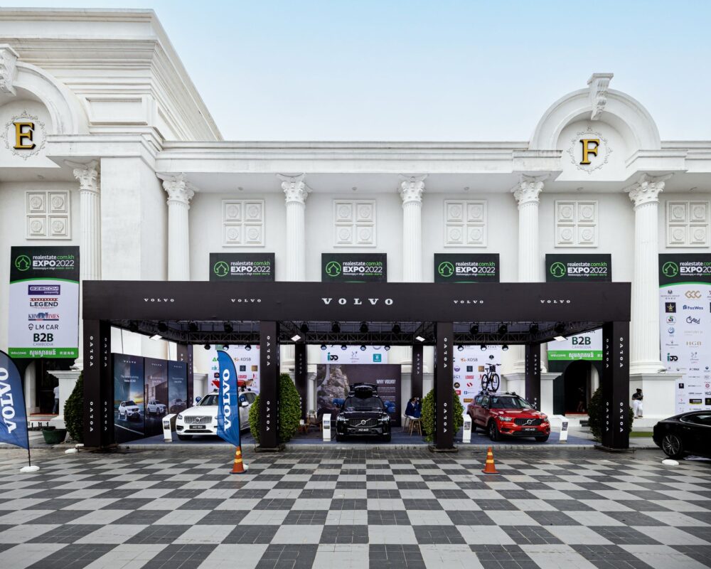
Have you ever walked through a trade show, expo, or retail environment and completely missed a booth that had something you actually needed? The reason often has nothing to do with the quality of the products or services being offered. Instead, it comes down to one fundamental problem: the signage failed to capture attention in the first place. When your booth sign is invisible to passersby, even the most skilled and engaging staff members are working with an enormous handicap. They spend their time and energy trying to attract people who never knew the booth existed, rather than engaging visitors who were already drawn in by effective signage.
1. Understanding Why Visibility Matters More Than You Think
The first few seconds of a person’s experience at an event determine whether they will stop at your booth or continue walking. During those critical moments, your signage is doing the heavy lifting before any staff interaction occurs. A sign that blends into the background or lacks visual impact essentially guarantees that most foot traffic will pass by without a second glance. Your booth staff cannot compensate for poor sign visibility by being more charming or knowledgeable, and they cannot chase down every attendee who walks past. The mathematics of event attendance work against you: if ninety percent of potential visitors never notice your booth exists, your staff can only meaningfully engage with the remaining ten percent.
2. The Cost of Invisible Signage to Your Bottom Line
When signage fails to attract visitors, the financial impact extends far beyond that single event. You have already invested in booth space, materials, staff time, and travel expenses to be present at the venue. Adding inadequate signage on top of these costs means you are discarding the entire investment on the chance that people will somehow discover you. Attendees at trade shows and expos move through venues with intention and time pressure; most are not browsing randomly but are trying to locate specific solutions or vendors they have already identified. If your signage does not communicate clearly what you offer and where you are located, you lose the opportunity to intercept visitors who are actively searching for exactly what you provide. The cost of invisibility is measured not just in lost conversations but in the complete wasted expense of your event participation.
3. Design Principles That Drive Attention
Effective booth signage combines several essential design elements that work together to stop people in their tracks. High contrast between your sign’s background and text ensures readability from a distance, which means attendees can process your message while still several feet away. Typeface selection matters significantly, because overly decorative or tiny fonts may look polished in isolation but render your message unreadable in a crowded, noisy environment. Color psychology also plays a role; the goal is not necessarily to use the brightest colors in the spectrum but rather to choose colors that distinguish your booth from surrounding competitors and align with your brand identity. A tech company using a black booth with white and neon blue accents will stand out differently than an eco-focused company using earth tones with emerald green highlights. The key principle underlying all effective booth signage is that visibility and clarity always take priority over creative subtlety.
4. How Poor Signage Undermines Staff Performance
Your booth staff bring expertise, personality, and interpersonal skills to their work, yet none of these qualities matter if they never get the chance to use them. When signage fails to attract visitors, staff members are forced into an uncomfortable position: they must initiate contact with passing attendees who may have no interest in stopping and who indicated no prior curiosity about your company. This approach creates awkward interactions, wastes staff energy on people unlikely to convert, and generates a negative perception of your booth as pushy or desperate. Conversely, when signage successfully attracts visitors, staff members can engage with pre-qualified prospects who have already demonstrated interest by choosing to stop. These conversations are more natural, productive, and enjoyable for everyone involved. Staff members also report higher job satisfaction when they are not constantly working against foot traffic that never knew they were there.
5. Common Signage Mistakes That Make Booths Invisible
Many organizations make predictable errors when designing booth signage, and these mistakes consistently result in reduced visibility and engagement. Using company jargon or internal terminology on signage is a frequent culprit, because your industry shorthand means nothing to attendees who are not already familiar with your organization. Similarly, signs that focus entirely on company branding without clearly stating what problem you solve or what service you offer leave visitors confused about whether they should stop. Overcrowding your sign with too much text or too many design elements creates visual clutter that repels attention rather than attracting it. Size miscalculation is another common problem, since a sign that works perfectly for a small retail storefront will be completely inadequate for a large trade show floor where attendees view it from greater distances. Testing your signage visibility in actual event conditions, whenever possible, can help catch these mistakes before they cost you attendee engagement.
6. Strategic Signage Placement and Support
Visibility extends beyond the sign itself to include where and how the sign is positioned within and around your booth space. A sign placed too high may be visible but unreadable; one placed too low may be hidden behind crowds or other booth structures. Multi-level signage that repeats your core message at different heights ensures that attendees approaching from various angles and distances can still receive your message. Directional signage that guides visitors into your booth space, rather than only marking your booth from outside, creates a complete visibility system. At events where floor space and setup time are both limited, exhibitors rely on retractable banners to quickly establish visible height and brand presence without requiring complex assembly or additional hardware. Lighting, whether natural or supplemental, dramatically affects how clearly your signage can be read in venues that often feature variable lighting conditions. Your signage should also be coordinated with your booth staff’s appearance, materials, and verbal messaging so that visitors encounter a consistent brand experience from their first glimpse of your sign through their final conversation with your team.
Conclusion
Booth signage is not a secondary consideration or a minor design element; it is the foundation upon which successful event engagement is built. When your sign fails to attract attention, your booth staff inherit an impossible task: they must work to generate interest that effective signage should have captured automatically, wasting both their energy and the event’s potential. By prioritizing signage visibility, clarity, and strategic placement, you ensure that your staff can focus on what they do best: having meaningful conversations with people who are already interested in what you offer. The difference between invisible signage and effective signage is often the difference between a successful event and thousands of dollars in wasted investment.